Brand guidelines.
How AUTZU looks, sounds, and operates across web, product, sales, investor, and recruitment surfaces. Built from the approved design direction: official wordmark, white/gray visual system, dark CTAs, realistic hub imagery, no legacy blue accents.
The operating layer for autonomous mobility.
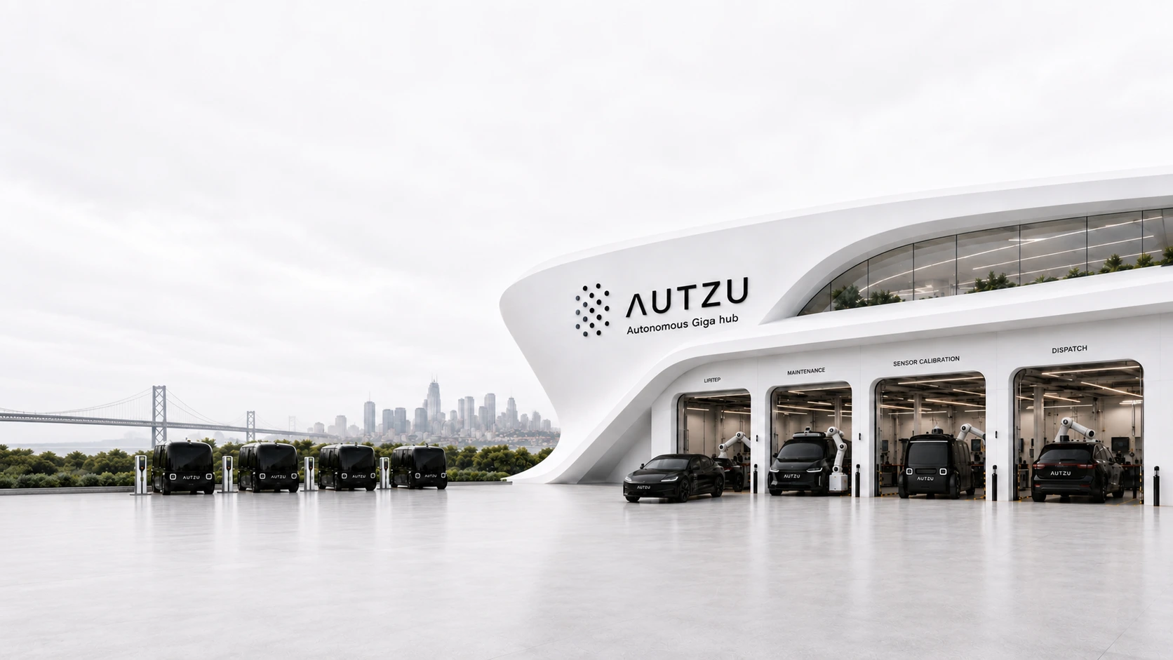
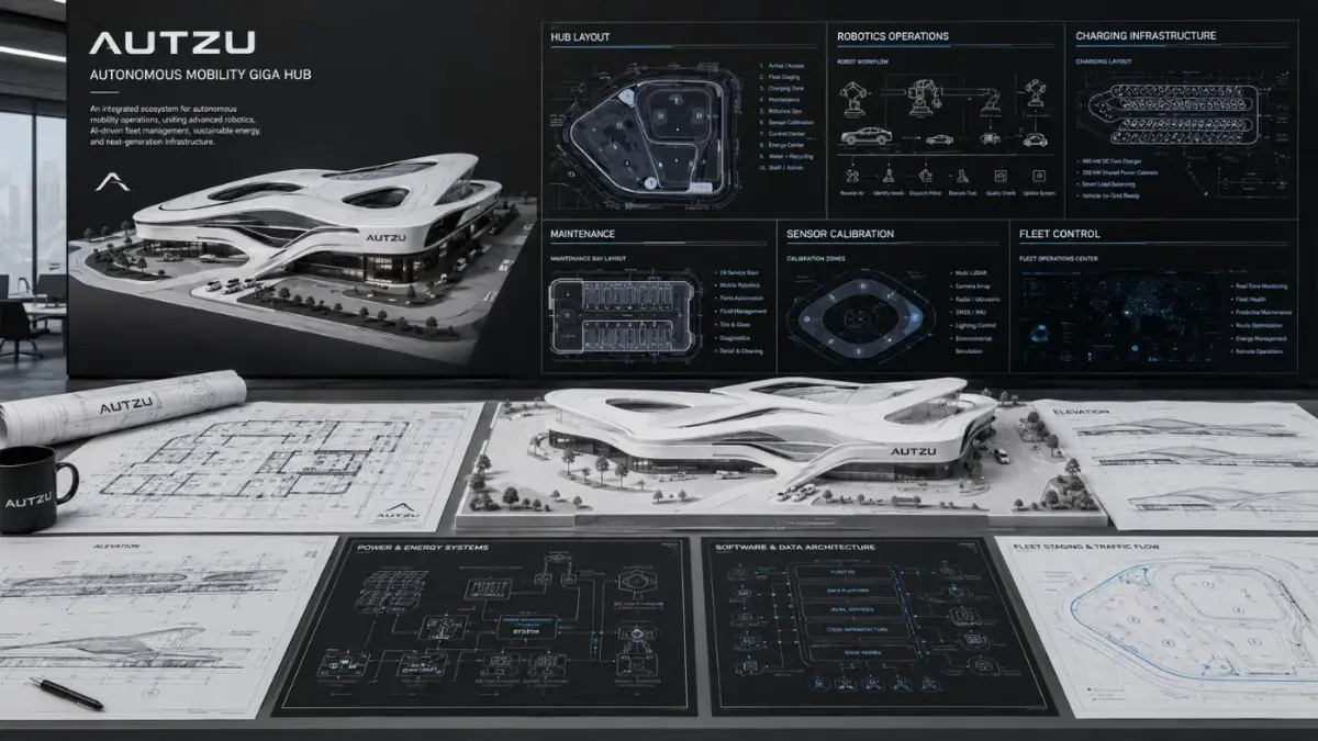
AUTZU builds and operates the infrastructure layer that powers autonomous mobility at scale: the physical hubs, robotics, fleet operations, software, charging, maintenance, calibration, and dispatch infrastructure that makes autonomous fleets reliable, available, and safe.
- Infrastructure-firstLead with hubs, uptime, operations, systems. Avoid pure software-only framing.
- Real, not speculativeRealistic photography and architectural visualization. No cartoon robotics or sci-fi exaggeration.
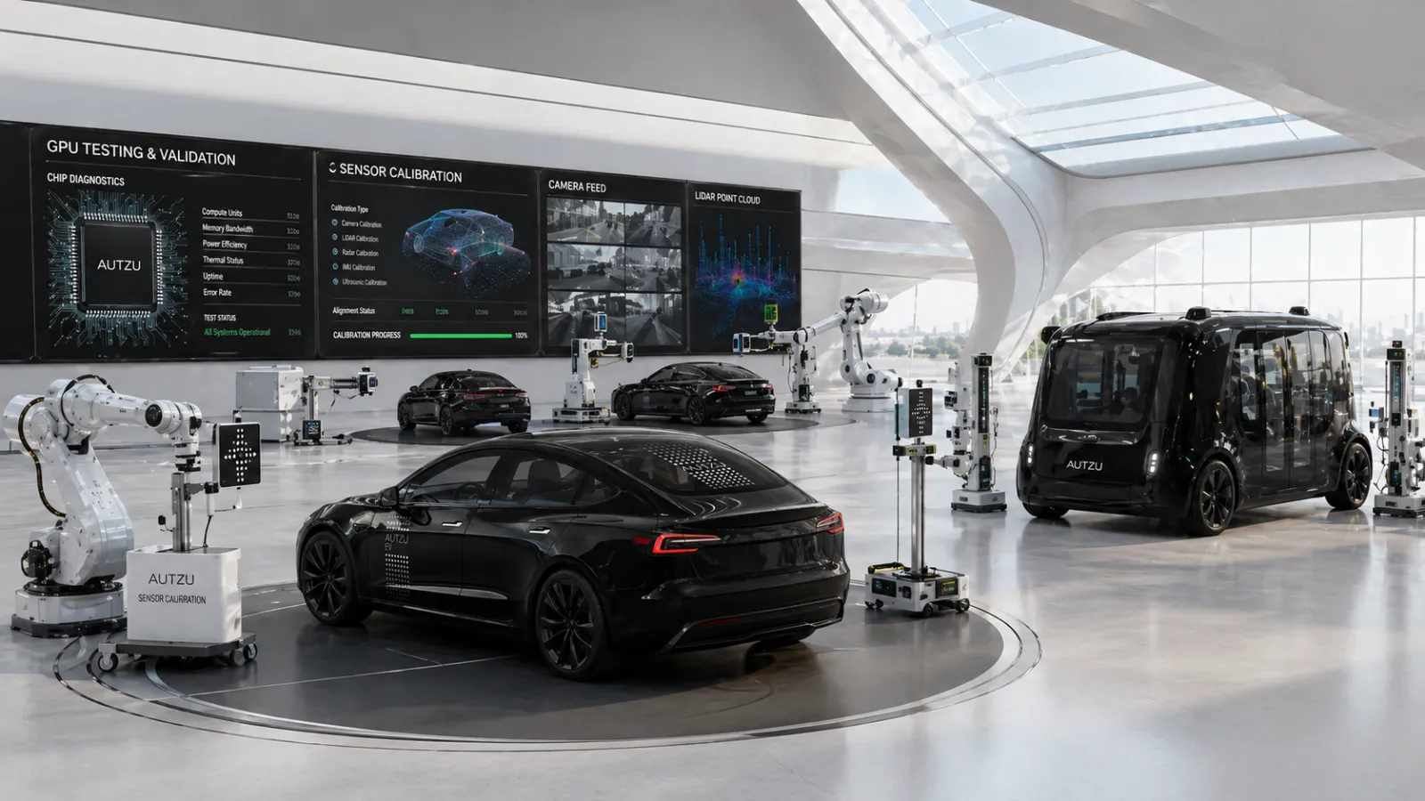
- Autonomy-readyShow maintenance, sensor calibration, robotics, GPU testing, dispatch, fleet visibility.
- Minimal and premiumRestrained layouts, white space, limited copy, dark CTAs, subtle gray structure.
- Agnostic and scalableNeutral and partner-ready. Avoid implying exclusivity to a single OEM.
- Tier 1Autonomous partnersOEMs, AV companies, rideshare networks, robotics and compute partners. Signal credible infrastructure capacity and operational reliability.
- Tier 2Capital partnersInfrastructure lenders, strategic and venture investors, real-estate partners. Signal discipline, unit economics, proof of scale.
- Tier 3Operating talentOperations, robotics, software, fleet, maintenance, safety leaders. Signal a clear mission and serious execution environment.
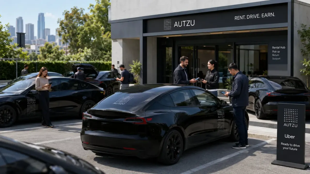
- Tier 4Drivers and fleet usersUsers of the current EV fleet and mobility operations. Signal clarity, availability, trust.
The wordmark is the mark.
Wordmark-only system. No legacy blue-A icon, no alternate lockups, no improvised marks.
- 01Clear space: at least the stroke height around all sides. 2× for premium layouts.
- 02Minimum desktop: 88 px in nav, 120 px in footers, 160 px in print/slide headers.
- 03Minimum mobile: 64 px in hamburger nav. Never compress horizontally.
- 04Proportional scaling only. Never set width and height independently.
White, gray, charcoal.
A restrained palette. The interface feels architectural and precise, not colorful. Dark navy is reserved for CTAs, footer, and high-emphasis panels.
- 01No bright blue interface system. No older blue accents, blue logos, blue CTAs.
- 02Black or dark navy for high-emphasis actions. White / gray for structure and reading.
- 03Charts stay restrained: light grid, charcoal labels, one subtle accent only if state requires it.
- 04Dark sections are deliberate: footer, primary CTA blocks, statement bars, key proof panels.
:root {
  --az-bg:      #F7F8FA;
  --az-surface: #FFFFFF;
  --az-border:  #E3E8EE;
  --az-text:    #111111;
  --az-muted:   #4F5B66;
  --az-dark:    #071822;
}Spare, strong, utilitarian.
Inter / system stack. Sentence case for headlines. The wordmark already carries the futuristic character — body type should disappear into the reading.
font-family: Inter,
  SF Pro Display,
  SF Pro Text,
  Helvetica Neue,
  Arial,
  sans-serif;
- 01Headlines 3–8 words. Short, declarative, sentence case.
- 02One headline + one short paragraph + one proof point per section.
- 03All-caps only for labels, eyebrows, and partner captions.
- 04No decorative, sci-fi, or overly futuristic fonts in body copy.
Realistic, bright, architectural.
Imagery should feel like an operating facility, not a concept-art poster. Overcast premium light, soft reflections, clean gray and white surfaces.
- ✓Proportional scaling — set width × height with object-fit explicitly defined.
- ✓Realistic photography and architectural visualization.
- ✓Overcast, bright, premium architectural light.
- ✓Every image reinforces one theme: hub, uptime, robotics, software, safety, scale.
- ✕Stretch or squeeze vehicles, buildings, dashboards, or partner logos.
- ✕Cartoons, neon sci-fi, overly saturated environments.
- ✕Warped robotics, blue-accent compositions, missing wheels.
- ✕Concept-art posters in place of operating reality.
Precise. Credible. Calm.
Operational language, not startup buzzwords. Speak to partners. Avoid consumer fluff. Let the operations speak.
- PreciseConcrete nouns: hubs, calibration, uptime, dispatch, charging, maintenance, robotics, software.
- CredibleNo inflated claims. Proof points, metrics, operational language.
- CalmShort declarative sentences. No hype, no exclamation marks, no buzzwords.
- PremiumLess copy, stronger hierarchy. Let architecture and operations imagery do work.
- Partner-readySpeak to AV companies, infrastructure partners, lenders, strategic partners without consumer fluff.
- The operating layer for autonomous mobility.
- Hubs built for autonomy.
- Operate at maximum uptime.
- One platform. Every layer.
- Building the foundation for autonomous mobility.
- Build the future with us.
- Let’s build the future together.
Airy. Disciplined. System-anchored.
Large media blocks, calm gray surfaces, subtle lines instead of heavy shadows. Dark CTA + dark footer are the system anchors that hold every page together.
#071822), white text, short verb phrase.Secondary: white fill, hairline border, only next to a primary.
- Page width1120 – 1280 px max
- Section padding80 – 120 px desktop · 48 – 72 mobile
- Card gap20 – 32 px desktop · 14 – 20 mobile
- Text measure45 – 70 characters per line
- Grid12-col desktop · 1-col mobile under 768
- StyleOutline, 1.5 – 2 px stroke, rounded joins. No filled cartoons.
- ColorDefault #111111 or #4F5B66. #071822 for active states only.
- Size20 – 24 cards · 16 – 18 product UI · 28 – 32 feature rows.
- MotionSubtle hover transitions. No spinning, bouncing, novelty motion.
Asset library.
Approved files only. Request a link via brand@autzu.com — every download is logged so we can roll forward versions cleanly.
Wordmark (SVG / PNG)
ZIP · 4.2 MBBlack, white, charcoal variants. Light & dark backgrounds.
Request file →Color tokens
CSS · 1 KBProduction-ready `:root` variables, matched to the brand palette.
Request file →Brand playbook
PDF · 1.6 MBThe full guidelines document — same as this page in printable form.
Request file →